
Practical Case where CSS Grid Make your Life Easier
Most of the time flexbox and other CSS solve the problem.
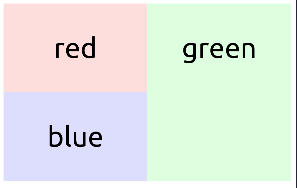
However, consider the case when the layout should look like this on mobile.
And this view below for desktop.

This is become harder where the green box need to span over where you cannot tweak it with flex order and flex-wrap.
CSS Grid
There comes CSS Grid to win over confusing display:none with @media and screen (...)solution.

On desktop we declare 1fr 1fr 1fr on the grid:
grid-template-columns: 1fr 1fr 1fr;
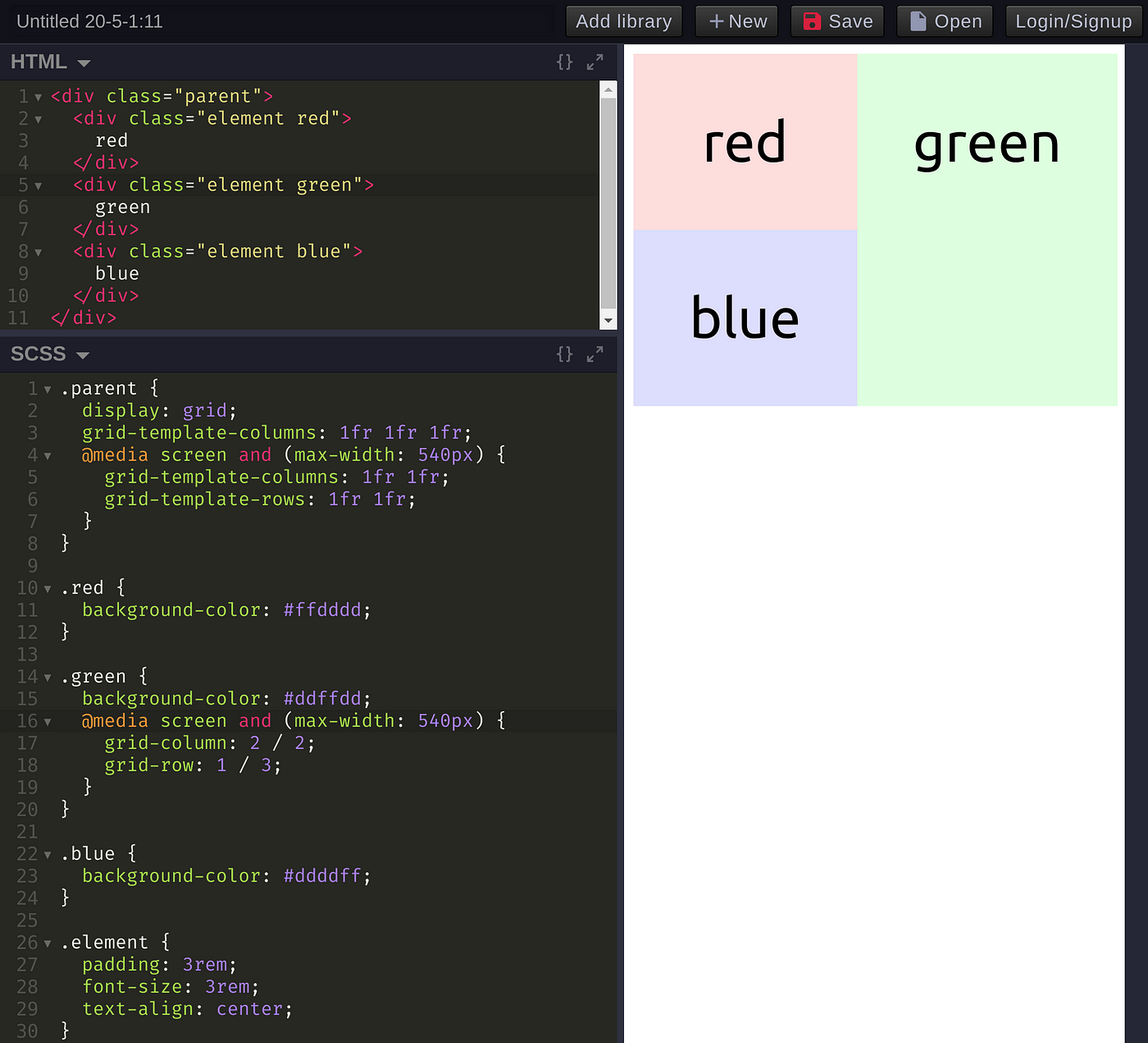
Then we overriding it with @media screen and (...) on mobile:
grid-template-columns: 1fr 1fr;
grid-template-rows: 1fr 1fr;
then you force the Green box to span with
grid-column: 2 / 2;
grid-row: 1 / 3;
Better than confusing hiding and showing depending on the screen size, aren’t we?
Hope this help !